Where words fail: Teach architects and urban designers like violinists
Rue Sainte-Catherine, Bordeaux, France. (Superbass / Wikimedia Commons)
A version of this article was previously published on Planetizen.
When I first visited Rue Sainte-Catherine in Bordeaux, France, there was a festival on the street, one of the biggest I’d ever seen. People were packed shoulder-to-shoulder as far as I could see.
I asked a passer-by what the festival was, and he gave me a confused look. There was no festival, he explained. It is just a great street, and a lot of people like to be there.
There are, of course, many economic reasons to visit a street like Rue Sainte-Catherine, such as working, shopping, eating, or having a drink. But the street owes that success to the fact that people are willing to spend time there. As many struggling downtowns have learned the hard way, for a main street to succeed, it needs to attract people.
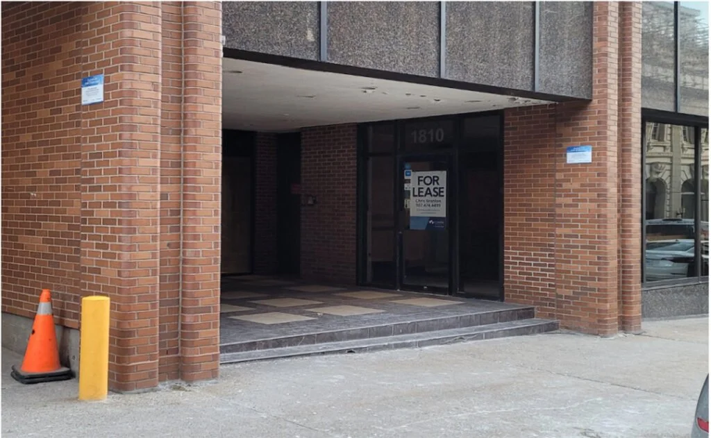
A struggling side street in Halifax, Canada. (Tristan Cleveland)
This raises a question: If it is possible to create great streets where people love to spend time, why not build more of them? Great streets were, after all, built by humans—not by an alien race. Termites build environments well-suited for termites. Why don’t humans?
I propose an unlikely culprit: words.
Design is visual. Words are not. Yet architects justify their work primarily in words, and municipalities govern design with long lists of regulations, written in words. The outcome is too often stultifying.
Denver Place, Denver. (Henry Desro / Unsplash)
In music, art, and surgery, people hone skills that they cannot fully describe in words. We need to learn to train architects and designers the way we train musicians. We need them to become virtuosos at an essential skill we cannot fully teach with books and words alone: to create wonderful places that people love.
Colmar, Alsace, France. (Samuel Hughes)
Architecture and design without words
When people focus too much on justifying a project in writing, it can distract them from what should be job number one: designing places where people want to be.
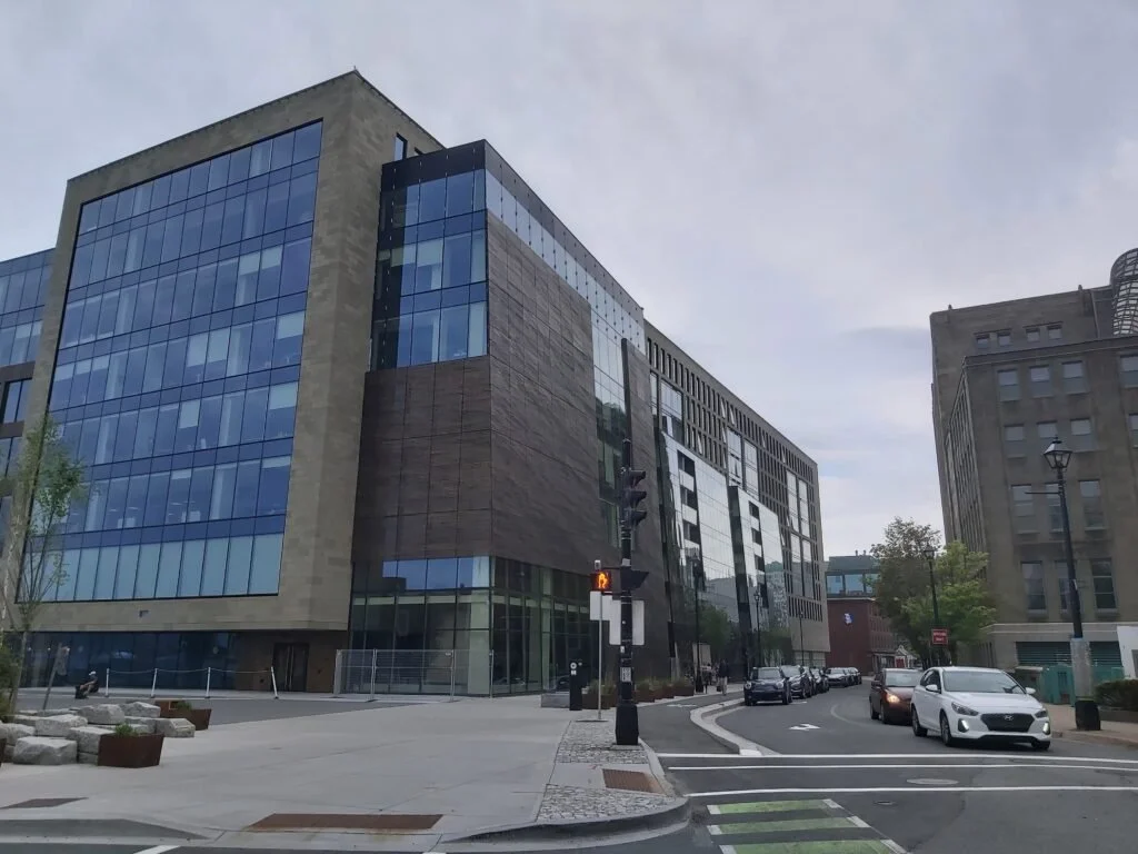
In my home city, Halifax, Nova Scotia, architects justified the design for the Halifax Convention Centre (pictured, left) by saying its two towers represent sails, referencing our maritime history. Another team chose copper cladding for Queen’s Marque (pictured, right), they say, to represent a material used on ships. Such symbolism is a nice gesture, but it does not make up for the blankness of each building.
Nova Centre, Halifax. (Tristan Cleveland)
Queen’s Marque, Halifax. (Tristan Cleveland)
The team that designed Queen’s Marque gave an impressive presentation at Halifax’s Design Review Committee, describing the project’s symbolism and meaning in grand terms, while saying little about the building’s impact on the street. The committee enthusiastically approved the project.
Words get projects approved, and words get attention for architects in magazines and scholarly journals. Naturally, then, architects focus on what they can describe in words. Symbolism, in particular, gets attention. But symbolism alone cannot convince anyone to walk instead of drive. It cannot create a lively street where locals feel comfortable stopping and chatting. It cannot make people feel grateful to be alive, the way a truly wonderful street can.
In contrast, it is hard to describe the stuff that really matters in words. Consider this pleasant little public space below. This would be a fine spot to sip coffee one afternoon, or to meet a friend.
Santa Cruz, Sevilla, Spain. (Johan Mouchet / Unsplash)
But why is it a good place? There is nothing new or exciting about the design. Almost nothing here symbolizes anything. One might name the architectural style, but most residents wouldn’t know it. It’d be hard to explain, on the written page, why the windowsills matter, much less the iron bars. One can use adjectives: cozy, warm, pleasant. But if someone claims the scene is not cozy, could you explain why they are wrong?
Yet the place feels comfortable as clearly as a C Major chord feels bright.
There is an uneven battle for attention between the elements of design that are easy to experience but hard to describe, and the elements that are easy to describe but irrelevant to experience. To fix this problem, we, as designers, need to learn to give power back to the non-linguistic parts of our brains.
The limitations of speech
Neuroscientist Barbara Tversky underlines the limits of words with a simple thought experiment.
Bring to mind the face of a close friend. Now, try to describe it. Can you use words to convey the image in high resolution, so I could picture your friend too? Do they have any specific bumps on their skin? What is the precise shape of their cheeks? How does each strand of hair fall?
A picture is worth more than a thousand words. The average English vocabulary is 20 to 40 thousand words, but we can perceive more than 40,000 details. Language can only convey a small subset of what the brain itself can perceive.
If you try to explain why a public square feels pleasant, it is a bit like trying to transmit a JPG with words. You can perceive it visually in a resolution that is millions of times greater than you can perceive it linguistically. So why measure its value linguistically?
Rigour without words
Language is often associated with reason. The synonyms for “wordlessness,” in contrast, evoke a kind of mystic flakiness: ineffable, indescribable, nameless, transcendent, and beyond words.
The association of language with rigour is misguided. Linguistic thinking can be flaky, and non-linguistic thinking can be precise and exacting. In their book, Suburban Nation, Duany, Plater-Zyberk, and Speck offer this example of an architect getting lost in linguistic thinking while describing a house:
"These distortions elicit decipherment in terms of several virtual constructs that allow the house to analogize discourse and call for further elucidation. These constructs are continually motivated and frustrated by conflicts in their underlying schemata and the concrete form in which they are inscribed. They refer to the ideal or real objects, organizations, processes and histories that the house approximately analogizes or opposes."
Words are not inherently rigorous.
Many rigorous skills, meanwhile, are executed without words: Think of the musician who plays precisely in tune, the artist who paints a perfect likeness, the surgeon who removes a tumour wedged between two arteries. These crafts are learned through hands-on practice; they cannot be learned by reading books alone.
In the 1700s, a group of German loggers lived in a small community in Eastern Canada called Lunenburg. They had a knack for building beautiful homes, so much so that the village is now a UNESCO heritage site.
Lunenburg, Canada. (Lars Plougmann / Wikimedia Commons)
The loggers did not, however, go to university to learn their trade through the written word, and, as far as I know, they did not judge each other’s work in written critiques. Of course they taught each other using words—they didn’t just point at tools and grunt. But they combined language with on-the-job, practical methods for teaching that go beyond words: demonstration, example, practice. Apprentices could learn how to swing a hammer, how to cut a cornice, how to shape a façade, so that together their designs conveyed a certain sense of quality, a precise cultural craft. These are tacit skills that would be difficult or impossible to learn through books alone, but they are certainly rigorous skills.
Consider the proportion of time a violin student spends practicing versus reading. Words matter. But words cannot replace the other components of learning.
Rigorous feedback for learning
Violin students can consult a tuner to see if they are playing in tune. Artists can see whether their painting looks like their subjects. Surgeons find out quickly if they accidentally poke a hole in an artery. These practitioners can practice wordless skills, in part, because they receive feedback on how they are doing. What objective feedback can architects and urban designers receive?
This question is particularly important after a century of being told that aesthetic preferences are little more than subjective. We need something to re-establish trust that there is in fact a difference between places people love and those people avoid. We need an objective yardstick.
Jan Gehl offers a simple solution: Measure where people choose to spend time, and where they do not.
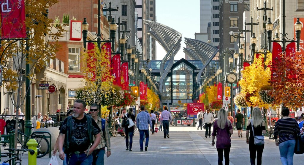
The west end of Calgary’s Stephen Avenue—the photo on the left—looks grey and dull. The east end, on the right, feels bright and vibrant. But these are just subjective feelings. Is there really a difference between them?
Stephen Avenue east end, Calgary, Canada. (Google Street View, May 2019)
Stephen Avenue west end, Calgary, Canada. (Bernard Spragg / Flickr)
Apparently so. In summer, 486 people walk through Stephen Avenue per hour in its west end, whereas 1,176 people walk through the east end, according to an analysis by Jan Gehl’s company, Gehl Architects. More importantly, people are three times more likely to stop, linger, talk, or sit on the east end.
These numbers confirm the rather obvious impression that the east end is more inviting. According to Gehl’s analysis, it is precisely three times more inviting.
Happy Cities has done similar projects verifying the real human impacts of design changes. In 2016, the City of Vancouver began a Pavement-to-Plaza program to transform roadways for cars into public spaces for people.
Before, 14th Ave. and Main St. (Google Street View, 2017)
After, 14th Ave. and Main St. (Alison Boulier, 2018)
In a series of Public Life Studies, we asked people hanging out in the new plazas how they felt while being there, and measured that data against surveys of people at comparable, nearby streets that had not been converted. We found that people at the plazas felt more trusting, included, open to social connection, and safe compared to people at the streets that had not been redesigned.
For example, at the plaza pictured below (right) at 14th Ave. and Main St., 90 per cent of people agreed with the statement, “This is a place where I would like to meet new people,” compared to only 45 per cent at a regular street nearby (left). People were also more trusting at this plaza, with 48 per cent believing that a stranger would return their wallet at the plaza if they lost it, compared to 29 per cent at the control site.
People were less social and trusting at the control site. (Google Street View, 2018)
People were more likely to meet friends and trust strangers at the Main-14th Plaza. (Alison Boulier, 2018)
With these studies, it becomes possible to hold designers to a higher standard. No longer can they simply claim their designs are impressive and effective on paper. They actually need to demonstrate that they have created a place where people want to be.
Where words are best used
Words are useful for everything that is generic, and some things are generic in people-friendly design.
Human-friendly streets tend to have a few key features that are now widely recognized in the urban design profession. These include a human scale, transparency, complexity, greenery, enclosure, and so on. Enclosure, for example, roughly means that the edges of the street are well-defined by trees and buildings, creating a clear sense of place. The concept helps to explain why this street in Aix-en-Provence, on the left, is more inviting than the one on the right, Herring Cove Road, in Halifax.
Cours Mirabeau, Aix-en-Provence. (Andrea Schaffer / Wikimedia Commons)
Herring Cove Road, Halifax, Canada. (Tristan Cleveland)
Enclosure highlights a key feature to look for. Alan Jacobs travelled the world studying the best streets, and he found that nearly all have a well-defined edge. If someone wanted to make Herring Cove Road a better street for walking, a good place to start would be to establish enclosure with new buildings along the sidewalk.
However, learning the definition of “enclosure” does not imply you have the skills you need to create a well-enclosed street. Some streets create enclosure with buildings, some with a park, some with hedges. On paper, streets may seem to have enclosure but fail to create this sense of place, due to a lack of coherence along the edge or some other issue.
While it is easy to learn the definition of enclosure, it is much harder to learn to recognize and create enclosure. It is, similarly, easy to learn the definition of the term “in tune,” but it is much harder to learn to play in tune (I never quite learned). The word “enclosure” can point you towards something that matters for human-friendly streets, but nonetheless, you need to spend dozens of hours comparing great and terrible streets to develop a sense of what it means in practice.
The same goes for human scale, complexity, transparency, or, more broadly, human-friendly design. Words can point to patterns a designer should learn to recognize. But recognizing these patterns is a skill. Learning definitions cannot replace that skill.
Don’t forget you have a brain
If aliens wanted to build streets that humans would love, they would need to develop complex mathematical formulas to identify the millions of details in a visual scene and predict how the human visual cortex will process these details. To be fully accurate, their formulas would effectively need to mimic the human brain itself.
The job is easier for us. We can use our own brains to see how others will see a street. With a bit of practice, we can learn to pick up on the elements that matter most, and how they fit together.
Our obsession with words has made us blind to the abilities of our own brains to recognize human-friendly places. It’s a skill we need to relearn, so that we can begin, once again, to create beautiful, pleasant streets people love—with consistency and rigour.
It makes no sense that humans so rarely create places that humans enjoy. We are building streets for ourselves, after all. We need to teach human-friendly design as a rigorous skill, so that every single new building, without exception, will contribute to creating streets where people want to be.


